Brightness on the shelf
- Carton Converter: Lucaprint S.p.A.
- Brand Owner: Nardini Distillati
- Structural Designer: Uff. Tecnico Lucaprint S.p.A.
- Graphic Designer: Hangar Design Group
- Cartonboard Manufacturer: Iggesund
- Pro Carton Young Designers Award
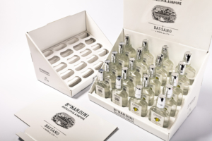
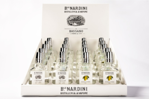
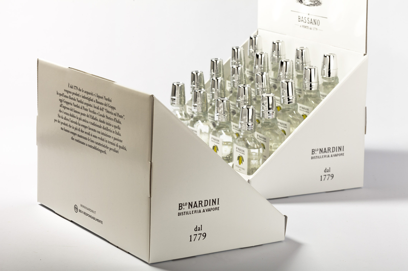
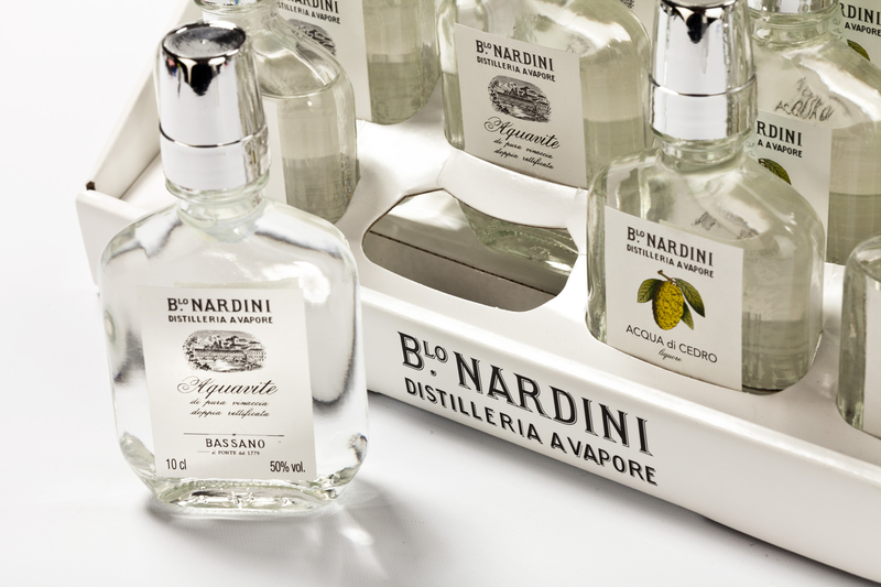
Lucaprint were involved soon after the first graphic designs of the agency. Together with marketing, the structural construction was reviewed to optimise the shape as well as removing those plastic components from the interior packaging which required too many adhesive bonds – in this way the number of adhesive bonds could be reduced to two. Nardini requested filling time for the product to be reduced to an absolute minimum, hence the proposal by Lucaprint to supply the presentation carton pre-fabricated, so that Nardini only needed to fill the product without removing the insert. The presentation carton communicates the brand identity of Nardini, with its established philosophy of simplicity which separates it from the competition – especially in supermarket chains. Lucaprint concentrated on the brightness of the product, together with a clear and focused presentation. Project development, from the prototype to market launch, took some time – especially finding a graphic design with optimal brightness. The first few designs had a black background with negative type! This new packaging has only been on the market for a short period, but the first sales results are very encouraging.







Jury Comments
This category is all about impact at the point of sale and this entry provided everything that was necessary in achieving this. The comparative simplicity of the graphic design with a great use of white co-ordinated well with the simple but clear printing and the silver tops on each of the bottles. The slope of the design would give this excellent visibility of either a counter or shelf and with a simple but effective closure it was also easy and safe to transport to the point of sale.