|
A study commissioned by the Ministry for Consumer Protection showed that packaging has the highest credibility levels in the marketing mix, after all, lies are not permitted on packaging. And if one considers how long a pack of cereals stands on the table during breakfast – that is an enormous media value!
Strategic design
There are five components which need to protectable for a premium brand: the brand name and its typo, the shape, the colour, the texture and – ideally – the sound. If we look to see how many brands actually conform to these specifications worldwide, one can probably count them on one hand. A brand’s appearance must be unique, unmistakable and protectable.
When we speak to new clients, we first look at the consumer and shopper insights. For example, in the case of Smarties the child is the consumer, and, as a rule, the mother is the shopper. One needs to address two different groups. Often, however, consumers and shoppers are identical, yet the needs for purchasing and consumption may well differ. We therefore need to clarify what motivates the consumer, what are the interference factors and where are the desires. Purchasing decisions are made in fractions of a second at the point of sale. The product must immediately communicate what it offers the buyer – and that is extremely difficult!
Once brand, shape, colour and texture exist, the self-similarity of the brand will always be high. This is then followed by careful adaptation of the packaging to the relevant target groups.
Sustainability of product and packaging
In the FMCG sector, consumer attitudes are not yet very pronounced with regard to sustainability. A good example here are the buying patterns for mineral water from all over the world – not just from local regions. On the other hand studies in Germany have shown that apparently 43 per cent of consumers do not buy products made by companies who damage the environment. With an increasing trend. Interestingly, the energy requirements for packaging are only a fraction of the requirements needed to manufacture the product. At the same time, packaging is the strongest outward visual signal of the brand and represents the values and ethics of a company.
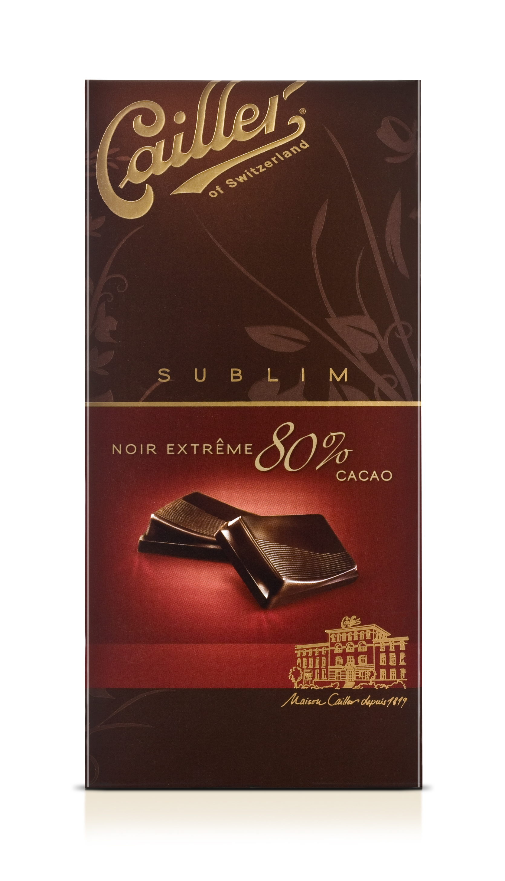
A few years ago the Swiss chocolate makers Cailler replaced their beautiful carton packaging with a plastic version, the brand nosedived. Consumers were more than disappointed by this new packaging which was perceived as being anti-environmental. In other words, if a company is perceived to damage the environment it is punished by the consumer. There is a change in attitude, certainly, but not a landslide, also because industry has put considerable effort into sustainability.
Meanwhile sustainability has become an issue for every product. However, one should note, that if the product therefore becomes more expensive, it tends to flop. Consumers refuse to accept products which become more environment-friendly and at the same time more expensive.
Paper and cartonboard are highly exciting materials as they can provide completely different haptic values and textures, be it via embossing and different surface structures. They are also eminently suitable for colours and brands. At the same time they are environment-friendly, a renewable raw material, and are fairly lightweight. There is no need to carry excess weight when shopping. The only negative is that cartons are not quite as flexible and easy to shape as plastics or glass.
Trends in packaging design
Special editions are truly exciting and will continue to increase: the trend is toward individualisation which is promoted by these special editions. Consumers are increasingly looking for products which look as if they have been designed for them personally.
There is also a trend which interestingly is attracting private labels: Keep it simple! The idea is to make it as easy as possible for the consumer and messages are limited to the essentials. And often the experience difficulty in managing this information. Those sending out simple and clear messages have the advantage.
In times of difficulties, such as the present crisis, items which suggest a certain lightness in attitude have a definite role to play. Hence, the motto „Have fun!” is a strong trend. Another important aspect is over-aging: our agency creates some 2,000 to 2,500 packaging designs every year. However, I can count the number of briefings on one hand where we were asked explicitly to design packs for elder target groups. And this, although studies have shown that 57 per cent of consumers will change their brands if they are not satisfied with the packaging, for example, if it is difficult to open or if the expiry date is difficult to read.
www.klisdesign.de
Pro Carton at Interpack, 12.- 18. May 2011, Please visit us in hall 7a Stand 7aB31. www.interpack.com |