| Date | 27th January 2011 / www.procarton.com | |||||||||||||||||||||
| Title | Successful Designs |
|||||||||||||||||||||
| Text | Packaging design is booming: which is not really surprising when considering that packaging represents the product at the point of sale. And it is amazing what cartons can offer – we have compiled some of the most attractive examples from the most important European packaging design competitions in 2010 for you. |
For download in print quality, please click on the photo. | ||||||||||||||||||||
|
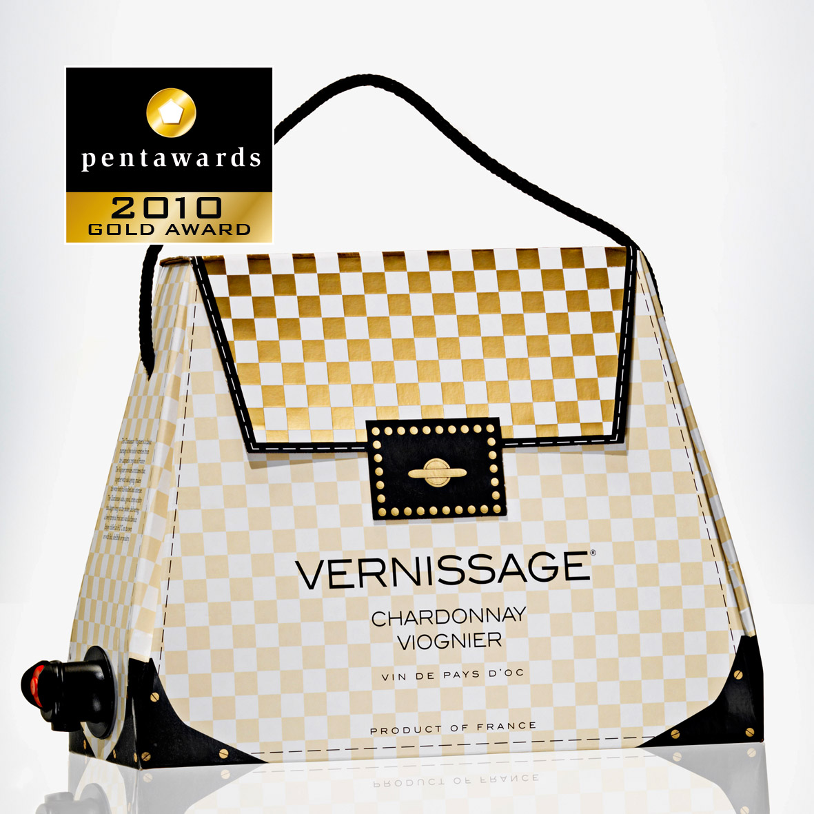
Pentawards http://blog.pentawards.org/ Well known to Pro Carton readers: the wine packaging “Vernissage“ by Oenoforos received the Gold Pentaward 2010 in the category Beverages – as well as winning the Pro Carton/ECMA Award 2010. A completely new Bag-in-Box system in shape of a handbag. And surprisingly, production is just as simple as with conventional Bag-in-Box systems, only filling is marginally more labour-intensive. “Vernissage” was launched in 2010 – with resounding success. For detailed information please see www.procarton.com
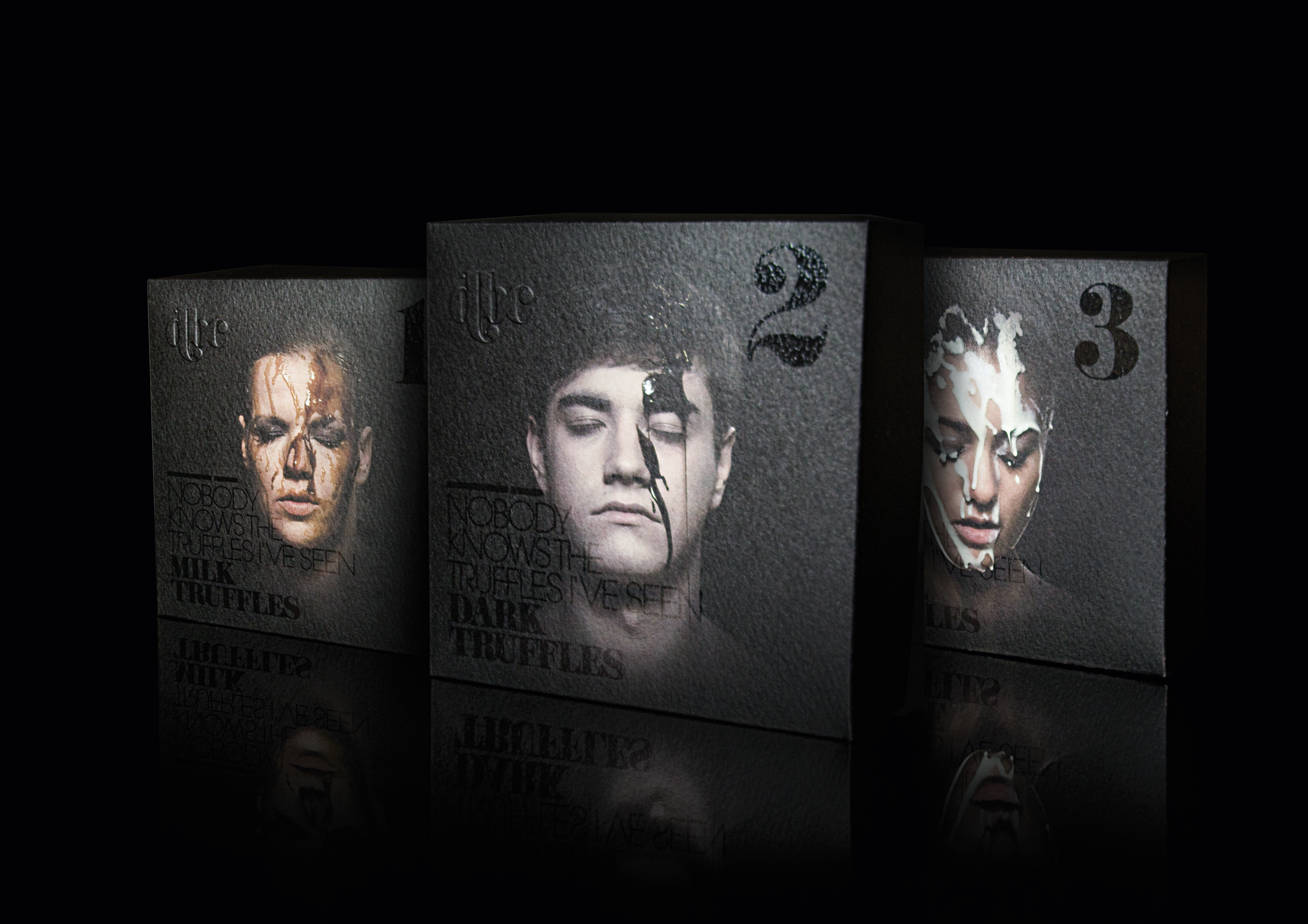
A carton with the ingenious title “death by chocolate“ by designer Denise Franke of Folwang University of Arts, Essen, received the “red dot: best of the best“ in Packaging Design. The history and effects of chocolate are shrouded in myths. The scientific term for the cocoa tree, theobroma cacao, means “food of the gods“, and for the Maya the plant was actually perceived as being of divine origin. Because of its alleged intoxicating effect it was „reserved“ for male nobility for a long period of time. In Europe and South America there is evidence that chocolate was also used for medicinal purposes, where it was recommended as a tonic, easy to digest and with aphrodisiac properties and was still sold as an „invigorating tonic“ in the pharmacies of the 19th century. The packaging, created for a fictitious maker of chocolate, dbc (death by chocolate), traces these myths and converts them into a modern day ironic style. The packaging depicts the portrait of a young person, the face covered with melted chocolate, and totally immersed in the pleasures of chocolate. The extremely elegant product range was partially enhanced with blind embossing and UV lacquer.
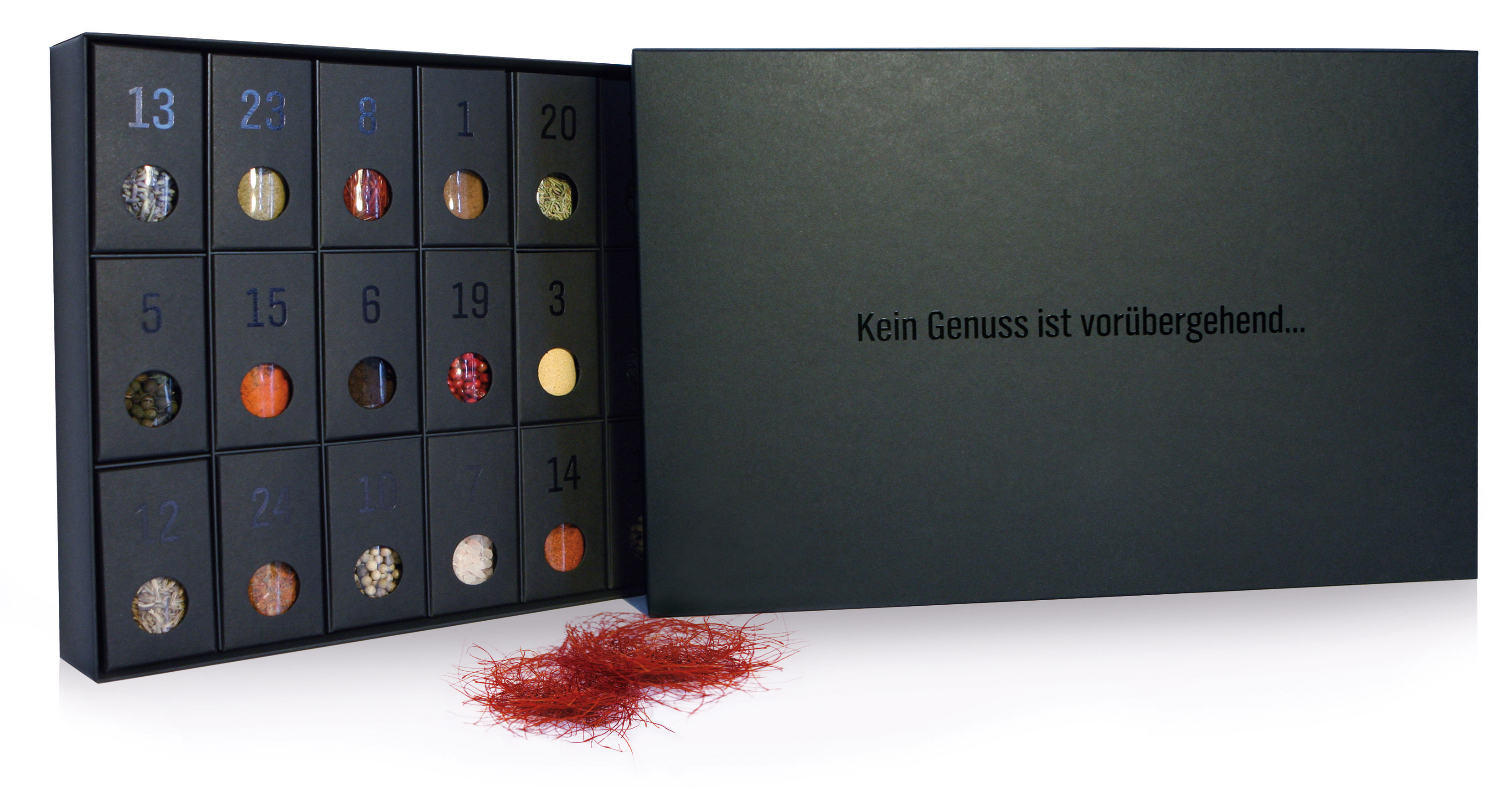
Another „red dot“ went to the advent calendar created by clormann design gmbh, Penzing, produced by Oliver Hauff, Hauff Druck Art. The shape of a modern day advent calendar for a collection of spices appeals to design-oriented households. Purist layout and hot foil stamping on high quality black paper underline the pleasure motto. Each of the hinged doors hides a jar with an exotic spice, together with an information sheet on origin and use of the spice and a fitting recipe. The jars are refillable.
Crisis management without incurring new debt is the message on the final example selected by us from the red dot awards: communication design 2010: the ”io-Box: 10 Euro und gut“ for Wein & Vinos OHG, Berlin, by Ruska, Martín, Associates, Berlin. The concept was to sell wine solely using PR-supported direct sales and this resulted in the eye-catching product packaging. The wine box was sent to editorial offices throughout Germany together with press material – and this certainly produced the desired results. A far cry from conventional marketing in this sector, the box for four bottles of wine focuses on a typo approach. Current crisis topics such as climate change and state debt are approached with fine wit and used as a selling argument for buying wine directly from the vintner.
if Design Award International Forum Design www.ifdesign.de
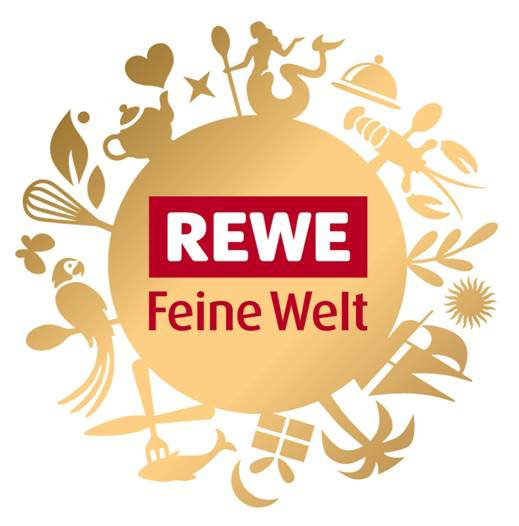
In 2010, gold was awarded to the brand “REWE Feine Welt“, created by the Peter Schmidt Group in Hamburg. The objective was to design an own world for the premium segment of the REWE retail group - REWE Feine Welt. At the end of September 2009 some 100 gourmet items – ranging from apple juice to goat’s cheese, were presented on the shelves. Brand development and packaging concept reflect the exclusivity and high value of the products. A central element of the design is the logo: a combination of exotic flair, delicatessen and pleasure in glowing gold with the REWE logo in the centre. The largely white packaging also displays the contents.
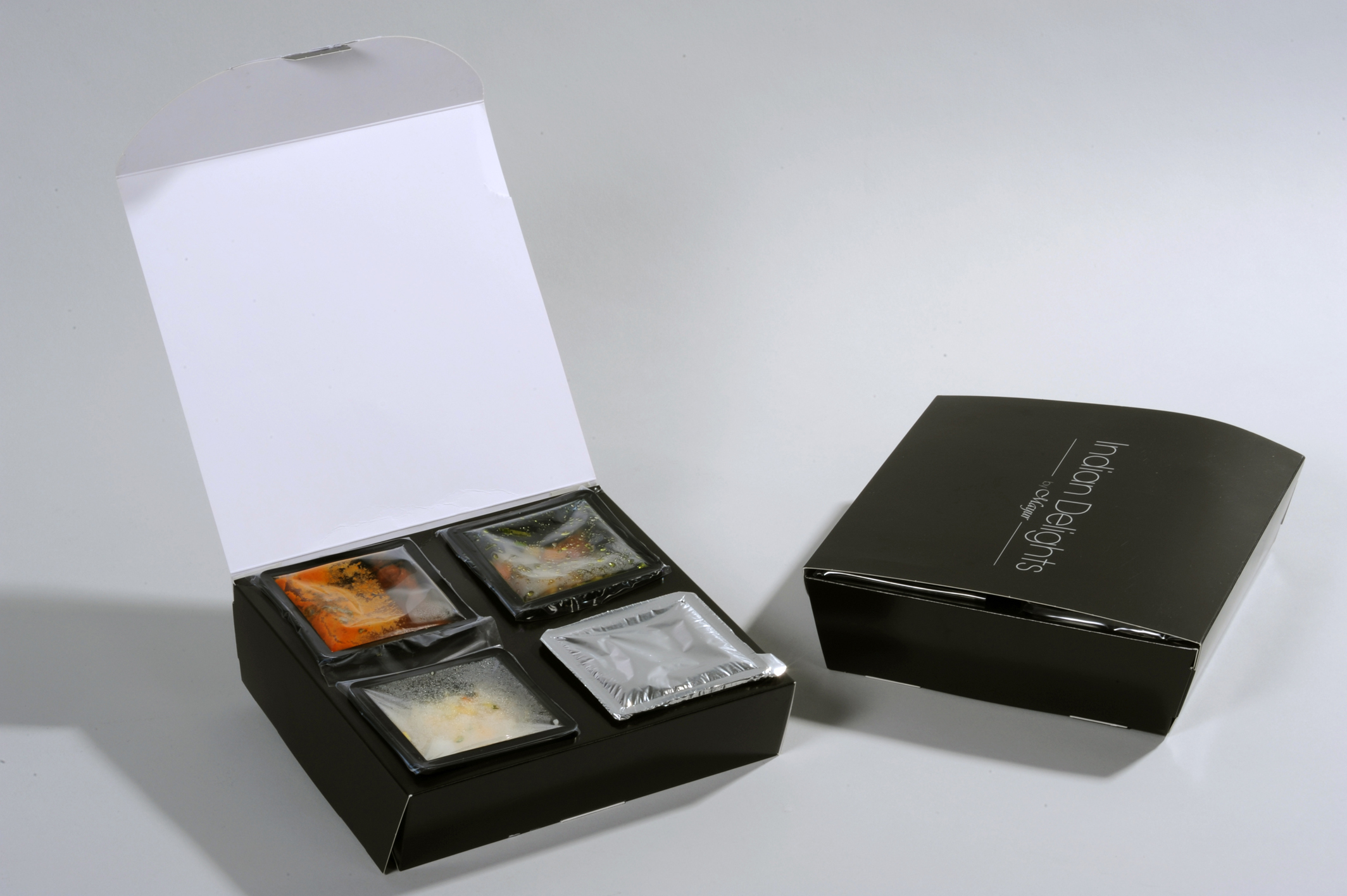
International German Packaging Award www.verpackungspreis.de In 2010, “CuliDish“ by wiezoplast awz bv, and designed by shieltronics netherlands, won a German packaging award: the novel packaging for menues allows single-step heating of instant meals in the microwave. The packaging components regulate the differing heating times of the separate foodstuffs and can be easily waste-separated. The minimalistic design is convincing and fits the overall concept well. The uses are manifold: from meals on wheels, to catering and the retail trade.
A further award went to “CEholo“ by Carl Edelmann GmbH: holographic patterns and structures are imparted via a process which simply modifies the lacquer layer. The process is both suitable for partial as well as full-surface application, i.e. for cartons made of cartonboard. This allows for completely new visual effects which can be created without the need for new tooling or stamping foils.
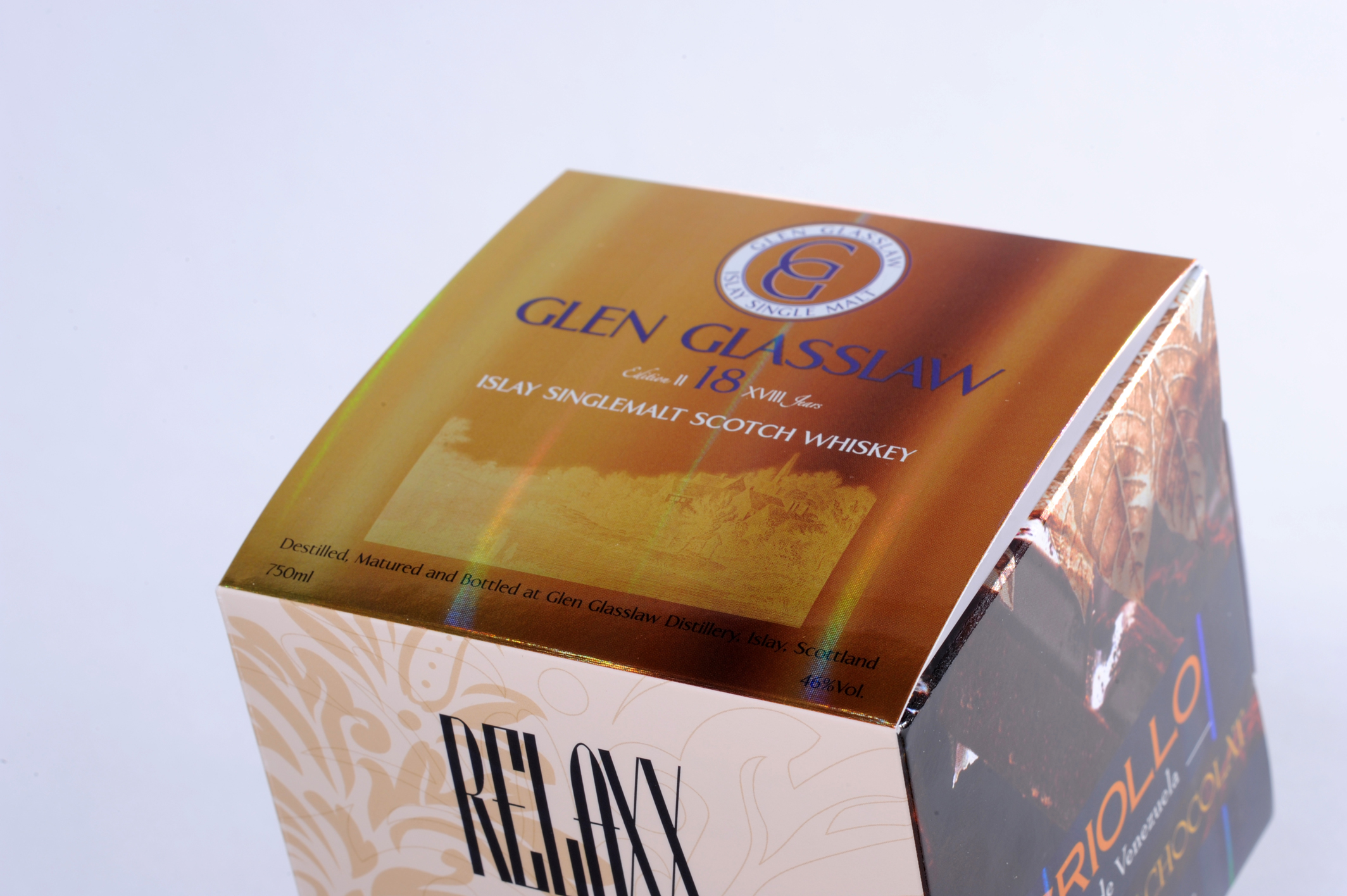
World packaging Award www.worldpackaging.org An award in the category Food went to Amcor Flexidity® by Amcor Flexibles – a tube packaging combined with a cartonboard sleeve which offers both protection and convenience. By simply squeezing the carton sleeve, the pack can be transformed into a robust stand-up pack which significantly facilitates dosing of the contents. Flat storage and transport are economical, and the added value for the consumer is highly relevant as there are no more opened bags with the contents “rolling around”. After use the packaging can be separated into the two components for easy disposal. The numerous printing possibilities of cartonboard offer potential for brand-relevant positioning and differentiation. Die Amcor Flexidity gewann auch einen International German Packaging Award.
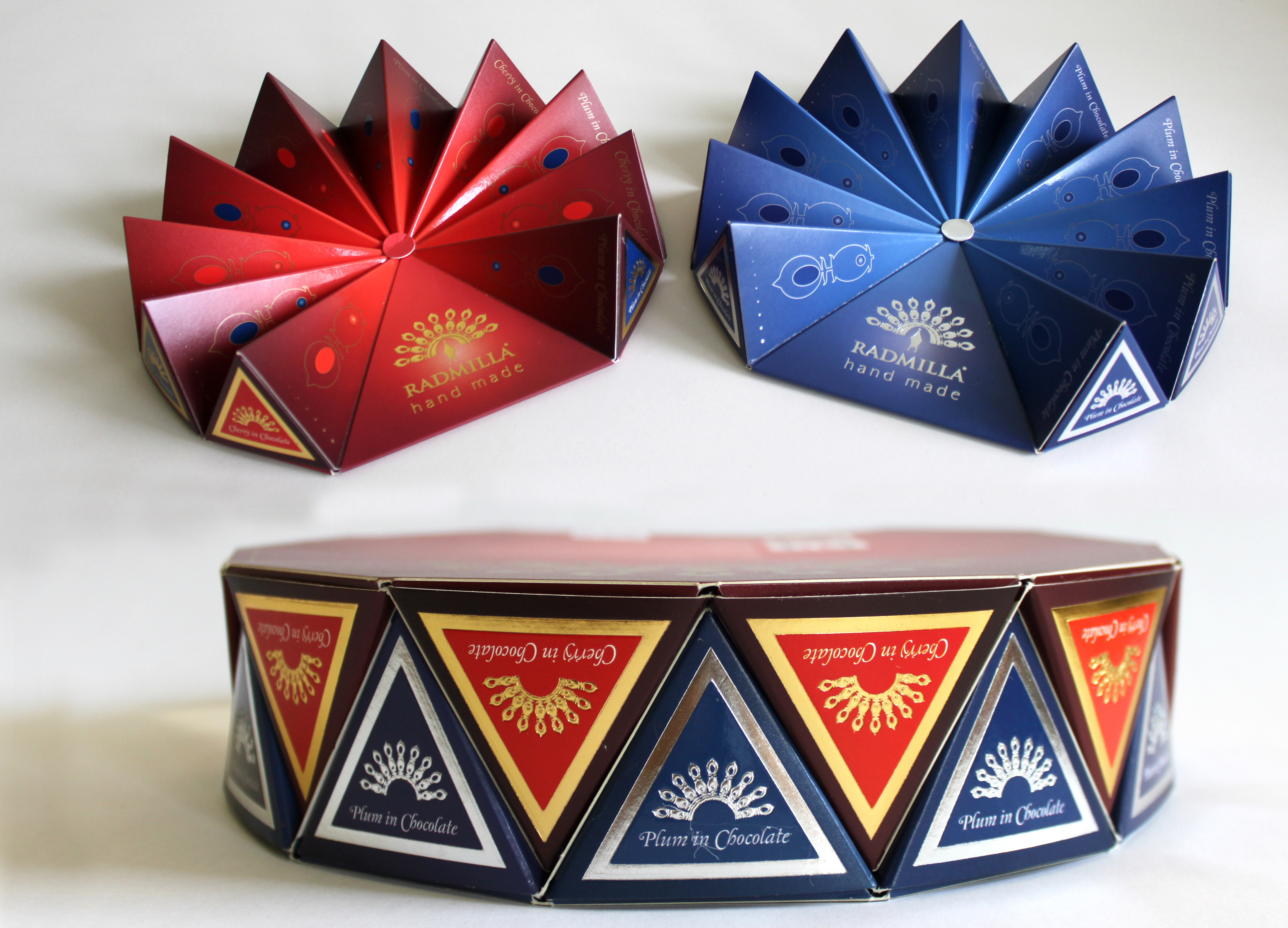
Confectionery is part of the Worldstar’s food category, and the winner was Radmilla, Cherries and Plums in Chocolate by Slovakian akciová spoločnosť. The carton is printed in six colours on both sides and finished with hot foil stamping. A special UV lacquer with gradual transition from gloss to matt was used on the perforated top section. Two boxes fit into each other perfectly so allowing excellent use of space during transport and storage.
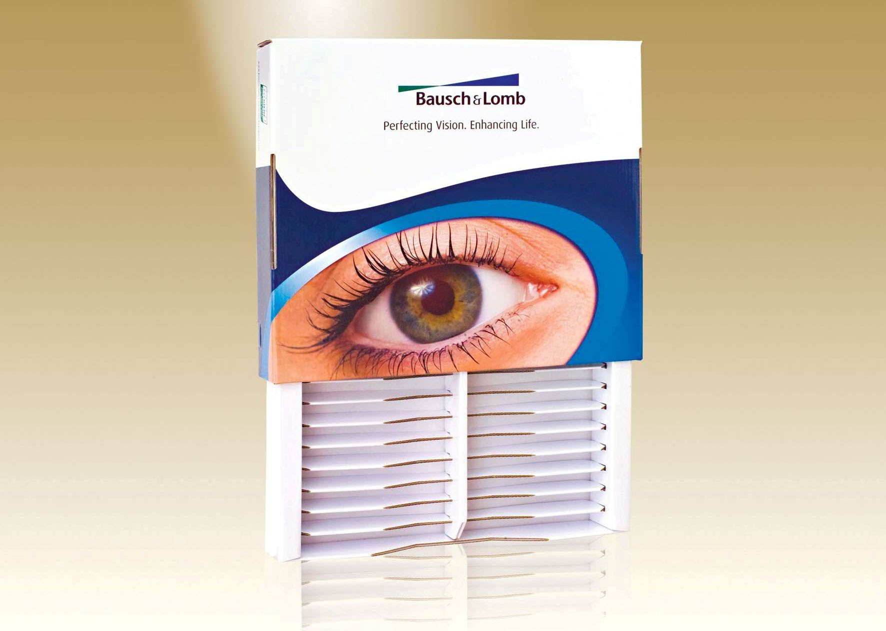
Pharmaceuticals and Medicals: A compact container by Keskeny & Partners Print Industrial LTD won the award in the category Pharmaceutical and Medicals: a multi-functional container for contact lenses. Plastic, metal or wooden elements were replaced by cartonboard, making the carton easier and friendlier to use. The selected packaging material also offers an excellent surface for marketing purposes and can be recycled. The compartments can be stacked to form a small shelf system. |
|
|||||||||||||||||||||
| Further Information |
Suzanne McEwen +43 1 218 6918 [email protected] |
|||||||||||||||||||||
| Background | Pro Carton is the European Association of Carton and Cartonboard manufacturers. Its main purpose is to promote the use of cartons and cartonboard to brand owners, the trade as well as designers, the media and politicians as an economically and ecologically balanced packaging medium. |